Good user experience means your website's beauty is in the eye of the beholder. But what if the beholder is blind or visually impaired?
In that case… beauty and accessibility become synonymous. Of course, when you're immersed in a major website development or re-design, it can be hard to think about accessibility for people with physical impairments.  Everyone is looking for the "wow" factor that will make the huge effort—and the price tag—all seem worth it.
Perhaps someone in your group mentions that inclusive design can be good for business. Or, more ominously, that there are government standards to be met. That might get you thinking along the lines of accessibility. But too often those good intentions turn into a check-list process, adding bits of code that sighted people actually don't see. Suddenly, the whole idea of "accessibility" starts to feel tedious.
There's a better way to look at it.
Like pretty much everyone else, visually challenged people come to your website because they want to know your story. So… give it to them in a way they can grasp. You'll find that the exercise can be rewarding in unexpected ways.
Visually challenged people come to your website because they want to know your story. So… give it to them in a way they can grasp.If your website is written and structured in a way that excites even a person who can't see the dazzling photography and colorful graphics—well, maybe you've hit a home run!
Here's an inspiring thought: The Greek poet Homer—who wrote two of the world's all-time greatest adventure stories—was himself blind. That didn't stop him from drawing a crowd, eager to listen to the spellbinding tales he could create in the mind's eyes of his audience.
Developing a website that is accessible even to those who can't "see" it, can be an eye-opener for those who can. The way to make it both interesting and truly successful is to focus on these three fundamentals.
1. Explain Yourself
Is a picture really worth a thousand words? Maybe so, but how do you get that message across to a blind person? The first challenge is to make sure the words are not only there—but worth reading!
The trend in web design these days is to bigger pictures and fewer words. It can be a brilliant design strategy for many websites… not so much for others. In the initial stages of brainstorming your design strategy, the important thing is to consider your audience, and the reasons they may be visiting your site. Does your audience include a higher than average number of visitors who may have visual or other impairments? If so, then don't treat accessibility as an add-on feature; it should be a fundamental driver of your design approach.
One example of this is blepharospasm.ca, a website for sufferers of a condition that can ultimately cause them to lose their capacity of sight. It offers a deep repository of medical information on the condition—whose primary manifestation is involuntary closure of the eyelids, often rendering patients functionally blind.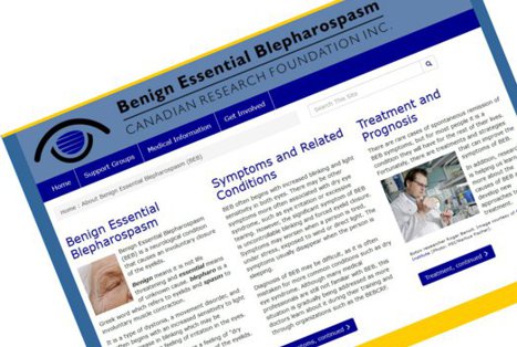
To make the site highly usable to people with a range of challenges, from weakened eyesight to total blindness, the brandigital team chose to create a homepage with smaller images interspersed amid long-form text. By studying the search queries that brought visitors to the site, we learned the questions to which they most urgently wanted answers. Right on the home page, visitors are immediately provided with answers to those questions, along with links to more detailed information.
Whether they have normal vision, or require a magnifier or screen reader, users can delve into the story from three different angles, and can follow optional trails from there to drill down deeper. For people with failing sight, this is a far more welcome approach than a big picture with a hidden alt tag, or masses of navigational drop-down lists.
Which leads to the second fundamental…
2. Be Logical
Designing for screen readers doesn't just mean adding markup to your code. Much more important is considering the flow of the story line, and building your content accordingly.
One of the big challenges for people who use screen readers is finding the narrative flow of a website's content, and staying on that track. The logical continuity of your content should be as simple as A, leads to B, leads to C.
Developing a website that is accessible even to those who can't "see" it, can be an eye-opener for those who can.Present your story in a way that might be enhanced by visuals for sighted people, but also inspires the imagination of those who can't necessarily see the pictures. When the story forks, the optional tracks should be clearly explained before the user commits to a path. This can tremendously reduce the frustration of the user who has gone down a dead end, and then must depend on keyboard commands and a computer-generated voice to pick up the trail again.
When you outline your textual content, you should have a clear vision of what you want to communicate, and make sure the words express it, whether the pictures are there or not.
Be simple and intuitive… Be informative… And…
3. Guide Gently
A blind person may become accustomed to the hazards of stepping off the curb at a two-way intersection. It may even become routine. But imagine that person standing on a corner at a 12-way intersection.
 The analogy is not far off from the experience of a user navigating a website with a screen reader, who is confronted with the elaborate navigational schemes of many current websites.
To a sighted person it may seem easy to scan around the page for navigational signals; but screen readers don't scan that way. For a vision-impaired person it can become a tangled web of confusing and contradictory directions.
That's the problem you create with a navigational system that depends on long lists of drop-down options—or (horror of horrors!) the multi-tiered fly-out of cascading lists—otherwise known as a mega-menu.
Even people with normal vision can find their eyes spinning with such a plethora of choices, well-intentioned though it may be. It may seem like a good idea to give the user access to every possible section and sub-section of your site with one roll-over of the mouse. But you should seriously ask yourself if you're doing your users a favor with this. And if you know that your user base clearly includes people who may be visually challenged—just don't do it!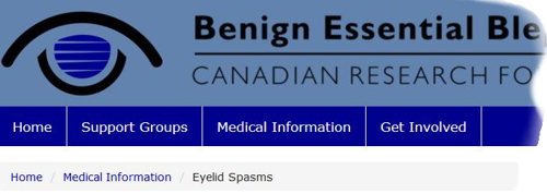
Going back to the analogy of the complex intersection, you need to guide your user by small increments. For this, a "flat" or linear navigation structure works best. For the blepharospasm website, brandigital developed a top navigation band with just three selections plus a home button, and no drop-downs. Each of the three top nav buttons leads to a major section of the site that then offers a vertical navigation list down the left side. This list provides top-level options that, where necessary, open up to lists of secondary options.
This linear prioritization of navigational elements makes the site easy to navigate, whether by screen reader or any other means.
The Takeaway: It's Not Just Markup, It's the Content
By far, most of the advice you will find on the internet about accessible web development is how to use hidden markup tags in your code. This is valid information—even essential—but it is not the whole story on accessibility.
If you remember one takeaway from this article, it should be to look at the structure of your content first, if you want a truly accessible site. After all, it's the content that needs to be accessible to humans, not the code!
Admittedly, the approaches suggested here are more important for sites whose user profile includes a higher than average number of visitors who are likely to have visual impairments. Although every site should be designed for accessibility, in many cases simply using a tool like WAVE or AChecker, and following its suggestions for back-end code improvements, can be sufficient. Whether you should take it to the next level is a judgment call you need to make—and it should be made early in the planning process for your site.
Having made the decision that your content is important to visually-challenged users, follow the three fundamentals outlined here, and try to make it the best website they may never see!
Your Turn
Have you come across an accessible website that really makes the grade? We'd love to see it! Did something in this article resonate with your experience? Give us your input in the comments section below and we'll check it out!
Comments